Why a new logo ISN'T the key to a great redesign

Scaling with the visual identity is not about squeezing every drop out of a logo.
Centuries ago, our ancestors used complex graphical depictions to represent things that they believed in. Those were complex images that make up a whole idea behind a country, business or authority were formed in various ways. The same goes for other cases, for example in coinage at different periods. Given their usually small size, both the obverse and reverse of a coin usually contained something representative of a state or the things symbolic of a specific region, culture, religion, as well as some information on where it was minted, its value, etc.
Using that same approach, by fitting every possible meaning and idea into a logo and later basing your design decisions on that will not bring your digital product any value. Instead, it will put harsh limitations on its design and brand perception.
Below are a couple of examples of these depictions.
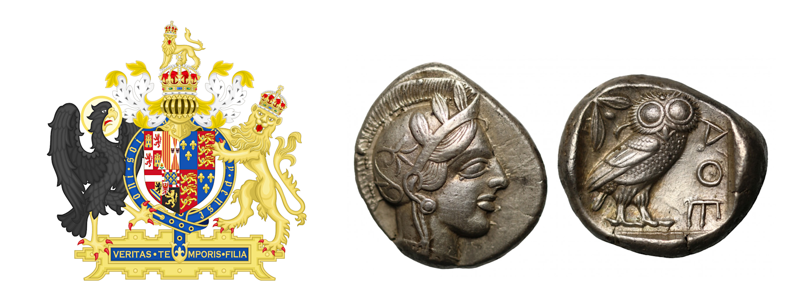
To the left, a UK’s coat of arms that is quite complex, saturated with various details to relay all the ideas and meanings they could possibly fit within one image. To the right, an ancient Greek coin from Athens (Silver Tetradrachm), depicting important symbols that were connected with the state.
Back then, such a representation was totally normal since there wasn’t a big variety of things such as there are now in modern businesses. There was simply no need of combining a marquee, emblem, flag, or coat of arms with other elements of visual identity.
A modern look at logos that once were old. The essence stayed the same.
Nowadays, if we go on popular design-related resources, like Dribbble, you will most likely find a ton of these:
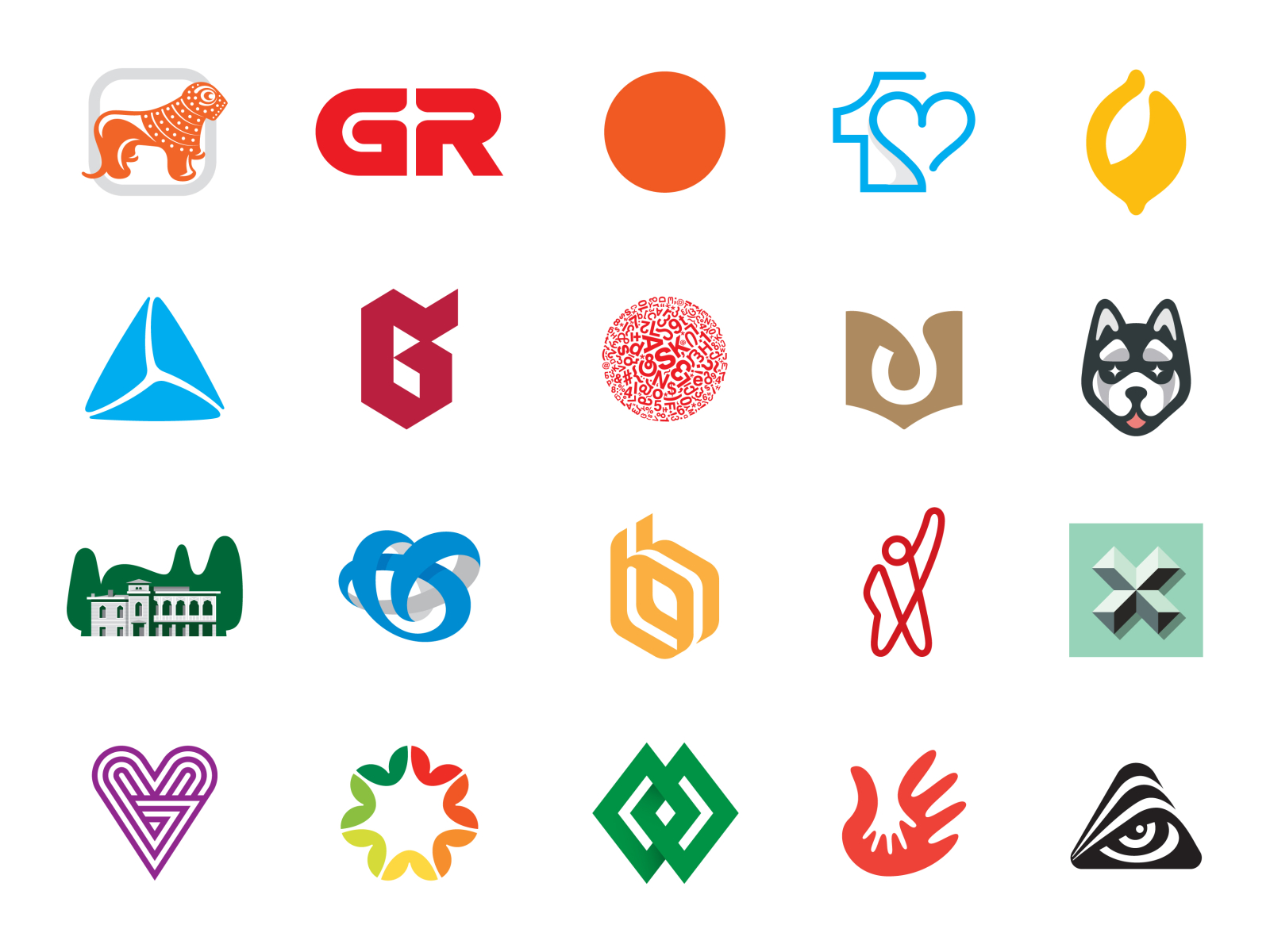
Please get me right, they’re structurally correct and some can be very aesthetically pleasing. But if we compare closely them to the visuals used by our ancestors we will for sure see some similarities.
Sure, they now look simplified, but most of them are still saturated with details such as shadows, blurs, gradients, and others. Not to insult anyone - there is nothing wrong with these if they're executed in a structurally correct manner. And of course, they can be complex if that is the intention behind them… The issue lies in something else.
The logo is not everything, but just a dot at the end of the Visual Identity sentence.
In a modern world of digital products, logos are just a small part that will represent your product. We believe that the logo in a modern digital world is not everything. Being a co-founder, CEO, or digital product owner you have to understand that it all works in the context of something. There are various parts of the product’s brand, such as marketing website, web-app, email newsletter, printed materials etc. So it’s not as it was back in the day when you can apply a single image for all these applications, as there were simply almost none.

Being logo-centric, by putting every possible feature of your product inside of a single image isn’t justified anymore.
Now, when someone looks for your company, for example via google search, they already know about your product and roughly what it does. So, cramming everything inside of a logo will simply confuse your user and make it really hard to understand.
We think that the whole idea of a great modern digital product is the ability to be scalable!
Scalability and strategic thinking. How can they help your product grow?
To be scalable is to allow your Target Audience to get a feeling of your product at different levels even without them seeing a logo. So whether it’s a website, an ad banner of a product, or even offline marketing materials - they should all be connected by the same design guidelines and style i.e. Visual Identity System.
Here’s an example of a logo we’ve created for BibliU, an edtech startup from London, UK. It was created with an idea that “B” is not just a book anymore, but rather content, since people nowadays can read on a variety of devices. The letter “B” opens the doors to new knowledge and can contain all kinds of content inside of it.

Also, a sneak peek at BibliU’s landing page.
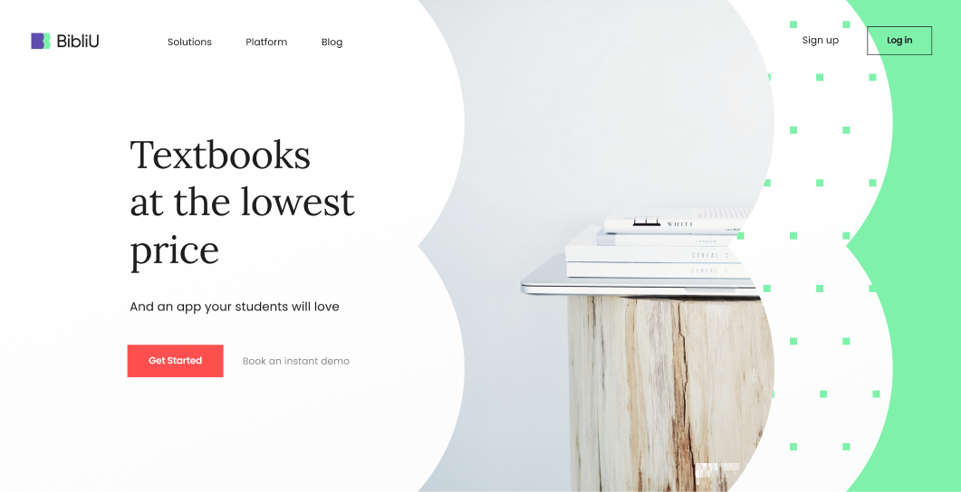
It’s important to have multiple "points of contact" with a user. So, we studied their product and finally created a shape that would spread this idea across all of their product parts, such as marketing website, social media, print materials, etc. In the end, it turned out to be rather great, in a way of how their VI was now communicating their product to the TA.
In the end, it’s about a combination of scalability, consistency, and idea behind Visual Identity transformed into something real.
“Hey, we’re just starting here... How do we go around strategic thinking and VI on our own?”

So, if you’re small or just at your starting stage, and maybe you don’t have resources for a brand agency to define who you are and how you compare to your competitors… A great option to gain some insights about your digital product is to get together with your co-founders and fill out a Brand Canvas form. This exercise will help you get a foundation to at least come up with some rough ideas for your first visuals.
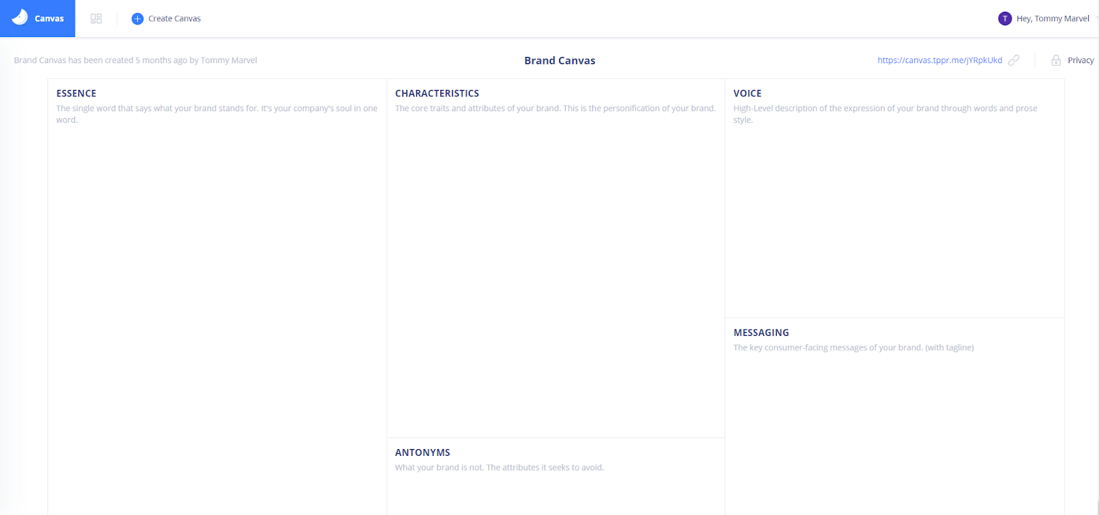
You can come back to it, after stumbling upon new findings, changing the Brand Canvas, or pivoting another direction if there is a reason to do so. After you’re settled with the strategic part with changes in place, you may now think about getting involved with a Visual Identity project.

Trusted by startups with $200M+ in funding:
Partners backed by:


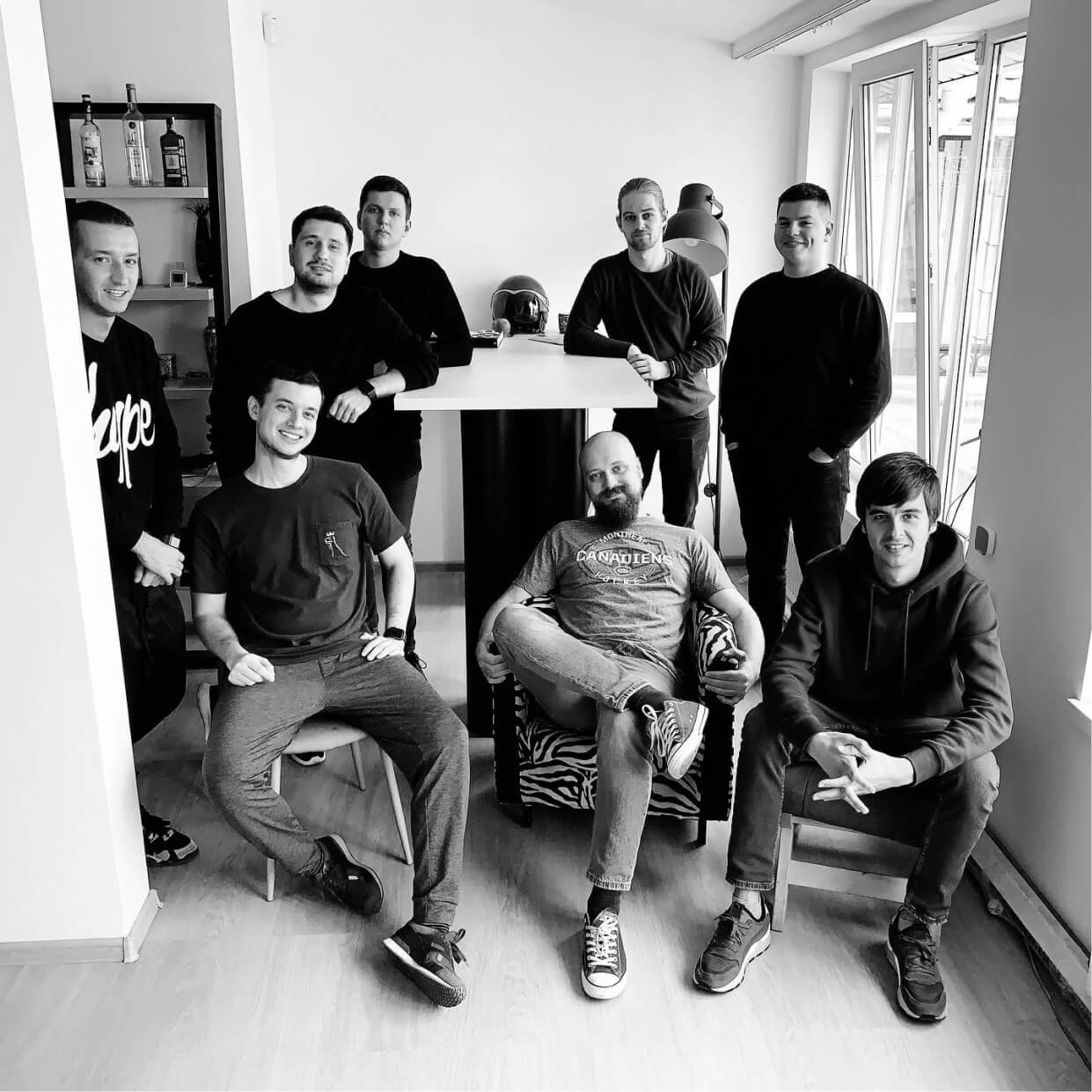
Small = effective
We are surrounded by amazing cultural and physical weather climates. Our HQ is located in Odesa — a beautiful seaside resort near the Black Sea. Anton Checkhov lived in this same neighborhood, and we are just one minute away from the opera house where Tchaikovsky conducted.
- Working with founders from Y-Combinator, US SaaS awards winners, guys from Forbes, Business Insider, Daily Beast etc.
- 6 years with same leadership team structure — right people at right seats
- Creative Director — Awwwards International Jury
- Got more than 100000+ followers across all design social networks
- Companies we’ve worked with got more than $200M+ in funding
- Spent $200,000 building our in-house web-app
